Product Strategy
Seamless Design Systems: Bridging the Gap Between Design and Dev
How to build a design system that equips design and development to augment with a paired evolution of system and product.
WRITTEN BY:
Christine Johnson, UX Design Director
Design systems have begun to change the way product teams build digital products. To clarify for this discussion, a design system is an organizing framework consisting of a body of patterns, components, and documentation.
When you have a proficient design system in place with focused cross-discipline collaboration, this allows your digital product to scale efficiently and with consistency through any product iteration. For example, the product team can reuse code that creates familiarity and, in turn, speeds up the build and evolution of the product. And taking into account the overall user experience, we want the users to rely on consistent interface patterns and interactions, ultimately making the product easier to use.
The Design System’s Missing Piece
Current conversation about design systems is leaving out one crucial piece in the process: the importance of design and development working together to build and manage the system, without the typical ‘handoff.’
This handoff behavior contributes to an inefficient, siloed workstream that falls apart when the product needs to evolve. Many designers in technology companies are focused only on building the components in their design tools and still hand them off to developers. This can’t be considered a functioning design system.
The components in these situations are just pattern libraries that are not interactive across the design tool and the codebase, and the team itself is writing and reading documentation about the system versus collaborating with each other in real-time.

When it comes to design systems, you can think of design and development as two sides of a coin. One is not without the other.
There needs to be an integration of system and team in order to have effective cross-functional collaboration to allow for quick decision-making for scaling and iterating on the product.
At Substantial, we built a design system for one of our clients that was based on a common language with real-time collaboration and alignment on terminology and intention from both design and development. By taking this approach, developers are able to build from the inside out rather than trying to reverse engineer a design by picking it apart once it’s handed off. Web designer Brad Frost describes this as “dumping a bunch of IKEA components on the floor and saying ‘Here, build a dresser!’”
Without guidelines or aligned intentions, it gets messy, and your team wastes valuable time.
Three Approaches to a Design System
1. The process should be cross-functional and collaborative with dedicated owners.
The process of building a design system from scratch takes time and effort, but the key is to build this with dedicated cross-functional owners who are also deeply involved and connected to the production of the product.
While building the client’s new product and design system, we assign one dev and one design owner that had a clear understanding of the desired outcomes of the overall product. This partnership is twofold:
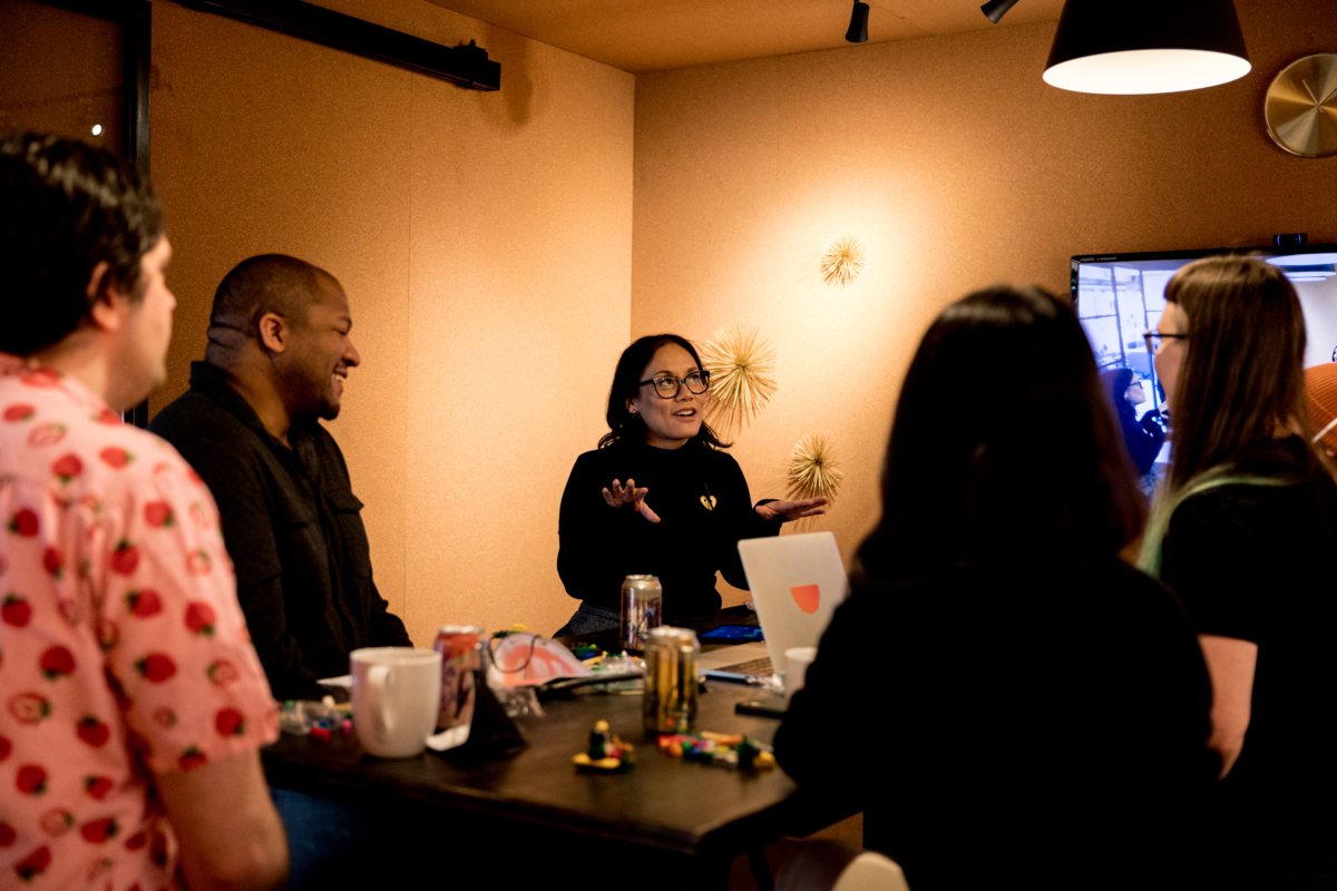
It helps developers better understand the purpose and intention within the design system, which allows them to know how to use and exercise the design system better.
The partnership also helps mitigate surface details for designers that may not be top of mind, like how something resizes at different resolutions.
The desired result is a true symbiotic relationship that develops through new builds, reviews, and discussions together based on user testing data, technology updates, and internal business needs. With an openly collaborative team dedicated to the system and the outcomes of the end product, the design system can continuously evolve through the iterations.
2. Build the design system at the same time in Figma and code, without handoffs.
In our earlier example, we began the process of building the design system by collaborating on the Core Library together. This meant the dedicated owners of the system first standardized the Theme, consisting of the typography and colors, and determined the standardized name coding.
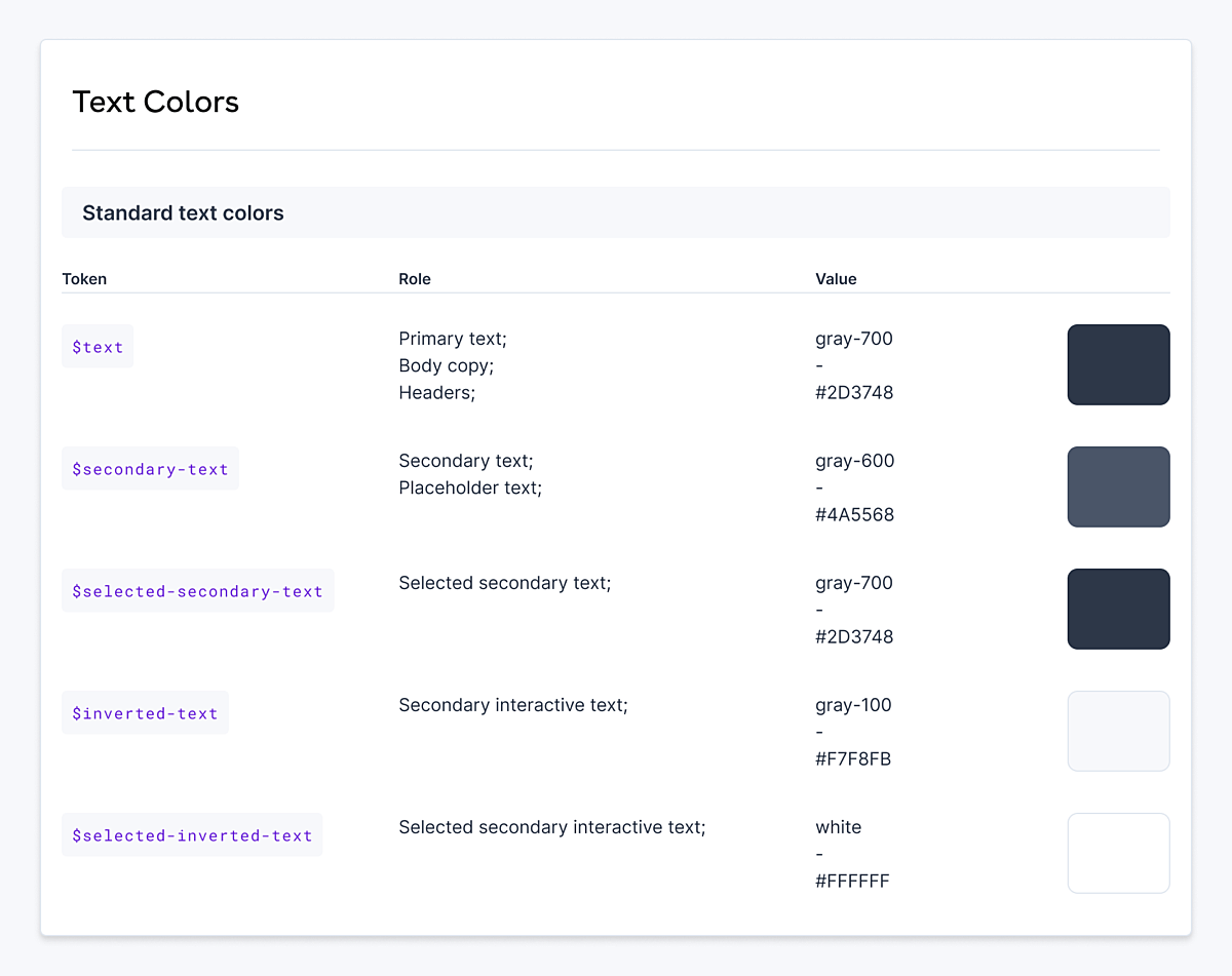
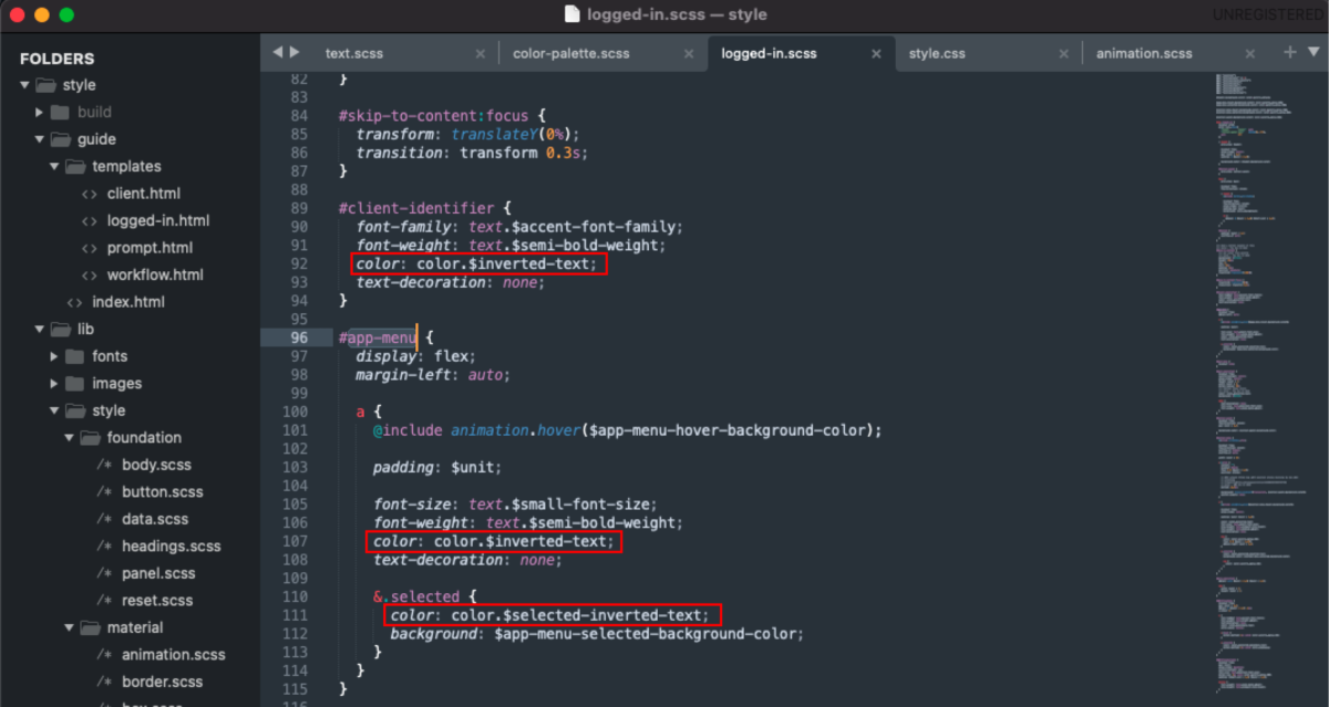
Building an agreement and understanding of each component of the Core Library together in both Figma and code allows the team to be aligned on every element and the intentions of the core system. The designs need to be implemented in code before being considered done in Figma.
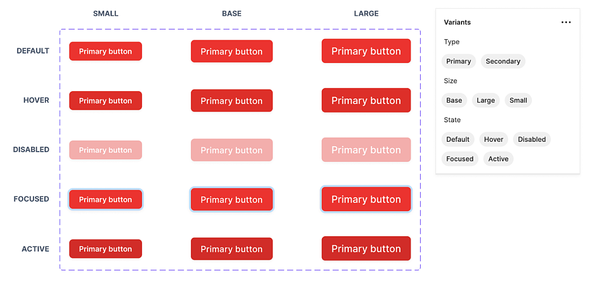
Once the Theme was built and congruent between Figma and code, the team began building out the components based on an understanding of the foundational needs within the product. For example, the team began building the buttons that would appear across multiple pages of the product. We created the needed variants of these components and built-in properties for each together.
It’s crucial to collaborate as a cross-discipline team in this phase, as alignment equals greater efficiency in further stages of the product build.
3. Only build components you know you need.
This stage proved to be a hugely beneficial process shift. By adding only components into the system that we knew we needed, rather than adding components we think we might need later, the team saved potential time lost and confusion.
When we designed a one-off component for a specific screen design, it was built as a local component within Figma and code for that particular design and was not added to the Core Library. Once that component was used elsewhere, it was added to the Core library, in Figma and code, by the dedicated team.
In the past, we’ve seen teams working within design systems who tried to anticipate all the possible variations of a component out of context. It’s nearly impossible to try to plan every scenario in the variations that might be used within the product.
For example, a couple of months down the line, the core library became bloated with an overly-configurable "button" component that has a hero, regular, small, stretch, call-to-action, and link variations, each with different states (active, inactive, hover and disabled), and in 4 different colors (primary, secondary, tertiary, quaternary). The most likely cause is that these variations were one-off use cases that weren’t needed in the current state build and, instead, were bulking up the design files and the code.
When you only build components into the design system that are actually being used, it allows the team to identify and stress test real-use cases for the components, and to identify and limit unnecessary variation which can lead to overly complex builds and/or inconsistent UX.
Key Takeaways
Design systems enable both designers and developers to build and iterate a digital product quickly because of early-and-often alignment.
The design system is deliberate and evolving, not just a static style guide.
- To achieve full efficiency, the design system has to be a paired evolution of system and product.
In order to make cross-discipline collaboration easier and smoother, teams need to be aligned on the naming conventions of components.
Build only the components in the Core library you know you need.
Even if your product is just a single page on a website, investing in the design system and process in the early stages is critical. Once a design system has been fully developed, the benefits are enormous.
Teams work faster. Clear process and collaboration reduce mental overhead and unnecessary work. The product is easier to maintain in Figma and React. And the product stays within a defined, but flexible, constraint for efficient growth.
When design and development are concurrent, your product team will save time and resources and will, in turn, have more room to celebrate the product's success!


