
Development
Part 3 // Manhole Monsters: An Introduction to Augmented Reality in iOS
PHOTO BY:
Seth Preillumination
BUILT & AUTHORED BY:
David Sklenar & Lemon Garrett
CONCEPT BY:
Mike Judge
Part 3: Swift UI & Ensuring Accessibility
We’ve covered a lot in Part 1 and 2 of this series. As you’ll recall, we trained a custom machine learning model to find an object in the camera feed and placed a 3D AR model on it. Now, we need to tie everything together and build an interface using SwiftUI to make our prototype usable. Speaking of usable, it should be usable and accessible for everybody, so let’s see what tools we can apply in SwiftUI to improve accessibility.
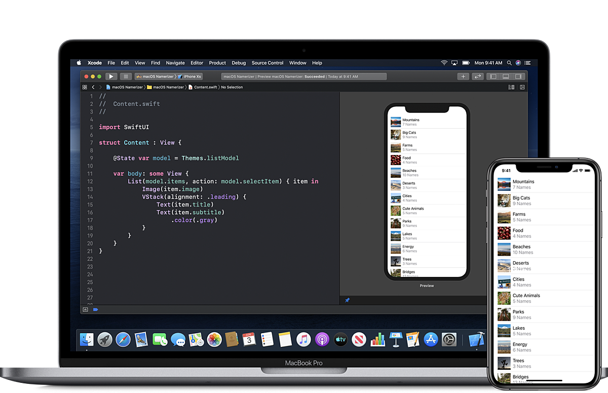
SwiftUI - Building the interface
SwiftUI is a fairly new user interface toolkit built by Apple, which lets developers build their apps on all Apple platforms in a declarative manner. This basically means that we define our UI as a product of the underlying state, rather than imperatively modifying the state (for example, when a user toggles a form field option) and changing the view hierarchy and layout when the state changes. This prevents a large set of UI bugs related to keeping your data and your UI in sync and makes your code more understandable. For those coming from web development, this is the same reason why React.js is so popular. SwiftUI is also interoperable with traditional UIKit apps, which means you can mix-and-match established ways of building UI (UIKit and Autolayout) with SwiftUI. Another added benefit is that SwiftUI has built-in support for Dynamic Type, Dark Mode, localization, and accessibility, essential components to any modern UI. For really stateful user interfaces, like forms or settings, SwiftUI is a slam dunk. We were really excited to dive into this technology and see how feasible it was for something more complex like a RealityKit/Core ML app.
Side note: one of the big benefits of SwiftUI is seeing your UI updated in real-time as you modify your code. This saves the developers a ton of time not waiting around for apps to compile, especially big apps. Having an augmented reality view was harder to preview, so we made sure to break out other interface elements into separate view classes to get the benefit of Xcode’s design canvas. Image: developer.apple.com
Okay, back to our project. After getting the 3D model properly placed, we wanted to make the app a little less...completely unintuitive. We started with simply overlaying a button that would dismiss the 3D model from the ARView, but that still wasn’t very usable. We decided to add some basic onboarding to encourage the user to understand and fully enjoy the app’s utilities. This would eventually become a splashscreen, which transitioned into a short series of instructional tabs that would lead the user to the camera view, where the current status of the scanning process would be displayed. The full flow can be seen in the gif below.
Structuring elements and their various layouts with SwiftUI feels a lot like web development. Most notably, there are wrappers called Stacks that can wrap elements and align them in a particular way, which we found is particularly reminiscent of flexbox. For example, wrapping two items together within an HStack will align them side by side horizontally, like with flex-direction: row. Wrap them in a VStack and you’ll align them vertically, like with flex-direction: column. Wrap them in a ZStack and you can layer them one on top of the other, like with the use of the z-index property in web development, where the order of the elements within the Stacks determines the order in which they pile on top of one another.
We also created an asset catalog specifically for Colors, which would contain our app’s color sets. Creating color sets allows us to associate colors with specific names within the app. Upon creating a new Swift file called ColorManager.swift, which would serve as the source of truth for custom colors for the rest of the app, we created a struct called ColorManager where we’d store static variables to keep track of our custom colors to use within the app by calling something like ColorManager.splash or ColorManager.primaryButtons. Managing colors like this would make accommodating good accessibility practices much more easily, like when catering to those with contrast sensitivities or color blindness. It also automatically applies the proper color for light mode vs. dark mode without any extra code.
We also discovered SF Symbols, a set of 2,400+ consistent, highly configurable symbols developers have access to. These were great for prototyping simple icons in the app and let us move quickly with a consistent, free icon set, without having to worry about image size.
Overall, we found SwiftUI to be a great boost in productivity. With no need to constantly recompile the app and run it as you’re building your user interfaces, you can iterate and tweak in near real-time. For an app like this, which required the camera, we did have to break out our views into separate objects to see the dynamic previews
Accessibility
Even in our first version prototype, we wanted to do something to ensure that the app was at least somewhat accessible and did some research on how to best go about doing that. It certainly isn’t perfect, but trying to make an inaccessible app more accessible is always the right thing to do. Using SwiftUI gave us a lot of accessibility features for free, but we found we wanted to go a little deeper.
After reading up about how to make games and/or AR settings more accessible, it seems that one of the simplest things one could do at this point was use haptics and play sounds upon changing the status of the scanner.
When going from “scanning” to “object found”, the device will vibrate and play a beep, and then when going from “object found” to “model placed”, the device will use a separate haptic and play a shutter click to indicate the process is over. This will help with a variety of impairments, ranging from visual impairments to cognitive impairments, like low vision or varying levels of information processing/problem-solving abilities.
Image(systemName: imageName)
  .resizable()
  .aspectRatio(contentMode: .fit)
  .frame(width: 120, height: 120, alignment: .center)
  .padding(.horizontal, 40)
  .padding(.bottom, 160)
  .foregroundColor(.white)
  .accessibility(hidden: true)
We also made sure that the UI itself was accessible via VoiceOver, the screen reader built into iOS. When navigating the onboarding screens, we hid the images from the accessibility tree by using the hidden modifier, since they did not offer any useful information to the user.
import SwiftUI

struct Status: View {
  var scanningState: ScanningState

  func getStatus(state: ScanningState) -> (text: String, color: Color, label: String) {
    switch state {
    case .scanning: return (text: "Scanning... 🧐", color: ColorManager.invalid, label: "Scanning")
    case .objectPlaced: return (text: "Placed object! ✅", color: ColorManager.success, label: "Object placed")
    default: return (text: "Calibrating... ⚙️", color: ColorManager.pending, label: "Locating anchor")
    }
  }

  var body: some View {
    let status = getStatus(state: self.scanningState)

    ZStack {
      RoundedRectangle(cornerRadius: 10)
        .fill(Color.white)
        .frame(height: 50)

      Text(status.text)
        .bold()
        .font(.largeTitle)
        .foregroundColor(status.color)
    }
    .accessibility(label: Text(status.label))
  }
}
We also added a label to the scan status indicator, so VoiceOver didn’t read out the trailing emoji’s name. That would get annoying after a while.
Adding accessibility labels and hints are extremely important for non-sighted users to be able to easily navigate the app and understand what each element does. We simply cannot understate the importance of ensuring one’s app is universally accessible. In this case, for the button to remove the model, there’s a label that reads, “Remove model” and a hint that reads “Removes model from view.” A label is more of a brief indicator of what action the element does, and the hint gives the user a little more information about what exactly might happen should they interact with that element and trigger that action. Apple suggests that labels within SwiftUI begin with a capitalized letter, and do not include a hard stop indicated by a period at the end of the phrase; whereas, with a hint, it should begin with a capitalized letter and be completed with a period.
Button(action: {
  self.scanningState = .scanning
}) {
  ZStack {
    Circle()
      .fill(ColorManager.invalid)
    Image(systemName: "gobackward")
      .resizable()
      .foregroundColor(.white)
      .padding(10)
  }
  .frame(width: 50, height: 50)
  .padding(.bottom, 30)
}
.accessibility(label: Text("Remove model"))
.accessibility(hint: Text("Removes model from view."))
Again, this is the bare minimum, but it’s better than shipping a completely inaccessible app.
Conclusion
When you start interacting with the real-world and taking advantage of some of the sensors on your phones, it opens up a ton of creative possibilities. The phone in your pocket is more powerful than you may realize. Throw machine learning into the mix and what you can build feels truly limitless. You could envision a ton of applications ML + 3D: plant identification, games that take clues or augment the real world, retail experiences interacting with real-world objects. We’re really looking forward to utilizing these great frameworks in client work and hope that we’ve inspired you to explore some of the vast possibilities they afford.
Tags:

David Sklenar (he/him)
Senior Developer
David is a software developer with over 10 years of experience. He’s spent most of that time developing iOS apps (most recently at Nike) and has used technology to solve problems in poetry publishing, medieval architectural history, cardiac health, and digital storytelling. More recently, he’s become interested in machine learning and its applications and implementation. He most enjoys the collaborative and social nature of software development and the endless opportunities for learning.

Lemon Garrett (they/them/she/her)
Developer, Substantial
A bit of a renaissance person, Lemon spent eight years as a traditional artist before eventually transitioning into a career as a software engineer, and found their way to Substantial in October 2019. As a full-stack developer, Lemon is a steadfast accessibility advocate and a zealous promoter of diversifying the tech industry in pursuit of creating and maintaining a more inclusive, supportive environment. Passionate about leveraging their knowledge in order to help make web and mobile apps universally accessible, Lemon is constantly seeking new, straightforward ways to integrate accessibility best practices into their teams’ workflows and approach to development.