Development
Accessibility in React Native
On building technology for everyone.
Author
Flo Truong
In mid-2018, the React Native team updated their API to include key accessibility properties. The changes expanded voiceover use, the color inverted mode, and a simpler cross-platform property for distinguishing UI elements.
On a recent project—a cross-platform, multilingual, educational walk guide—we combined these features with a few, simple design decisions. Together, we hope, more people are able to access the app and the stories it tells. Below outlines the choices we made, a list of resources, and perspectives I gained about designing for access.
Readability: Text Sizes
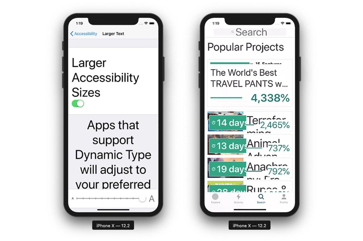
On both Android and iOS, you can increase your system font size. With iOS however, it can be enlarged up to a robust 300%.
When it’s not taken into account by app builders, it results in letters getting cut off and whole words can disappear. This can occur even at medium to large sizes. Instead of assuming people won’t enlarge their text, we found it helpful to design for the largest. That way, we inherently solve for all the sizes in between.
Tactic 1
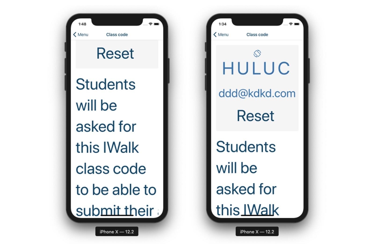
Allow screens to expand
Nest all Views inside a ScrollView component for an expandable layout. Without a Scrollview wrapper, the layout is static and won’t scroll. In this example, the content is justifyContent=“centered”, so what you’re seeing is the ’middle’ of that view (left). With ScrollView, all the content is viewable and scrollable (right).
Tactic 2
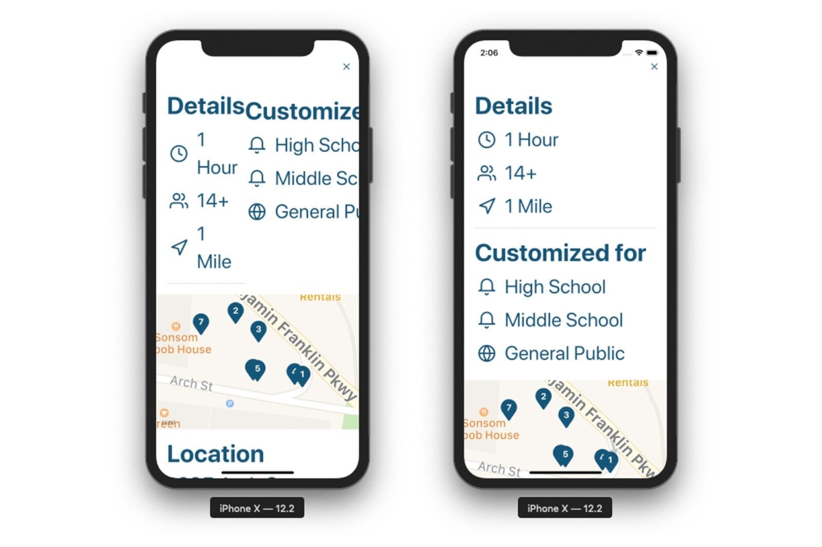
Design with vertically stacked layouts
Words lose their readability when they’re broken over several lines. To reduce this likelihood, we designed the layout to be a single column as much as possible. This provides horizontal space for words to grow more freely. A two column layout (left) easily breaks the readability. By designing layouts around a vertical orientation (right), it has a better chance of withstanding size changes.
Tactic 3
Turn font scaling off when necessary
With allowFontScaling={false} you can opt to ignore a phone’s text size setting. We used this sparingly and with caution on UI elements that have limited space. For example, we have a custom toggle component and we opted to have the UI retain its form and thereby its ergonomics.
Tactic 4
Scale SVG icons
Icons are part of an app’s lexicon and should also be readable at different text sizes. We applied the PixelRatio.getFontScale() method as a multiplier to our default icon size. In other places we disabled font scaling, for example the close icon in the navigation bar remains at a fixed size.
Icon size=“16 * PixelRatio.getFontScale()”
Tactic 5
Turn on or off other content
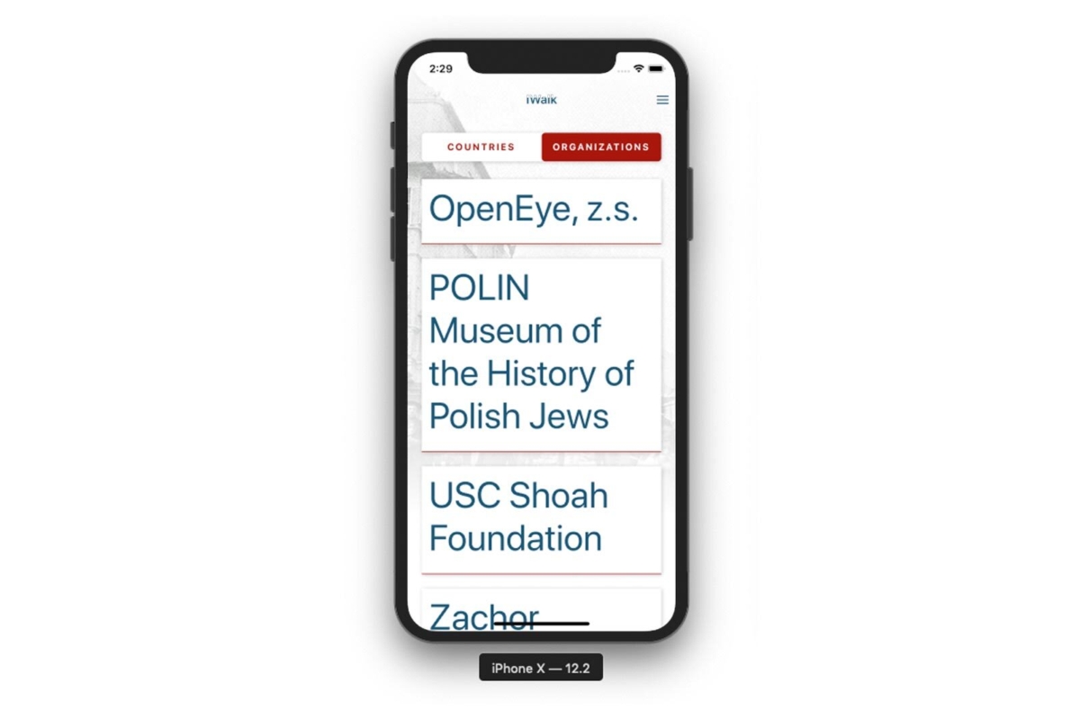
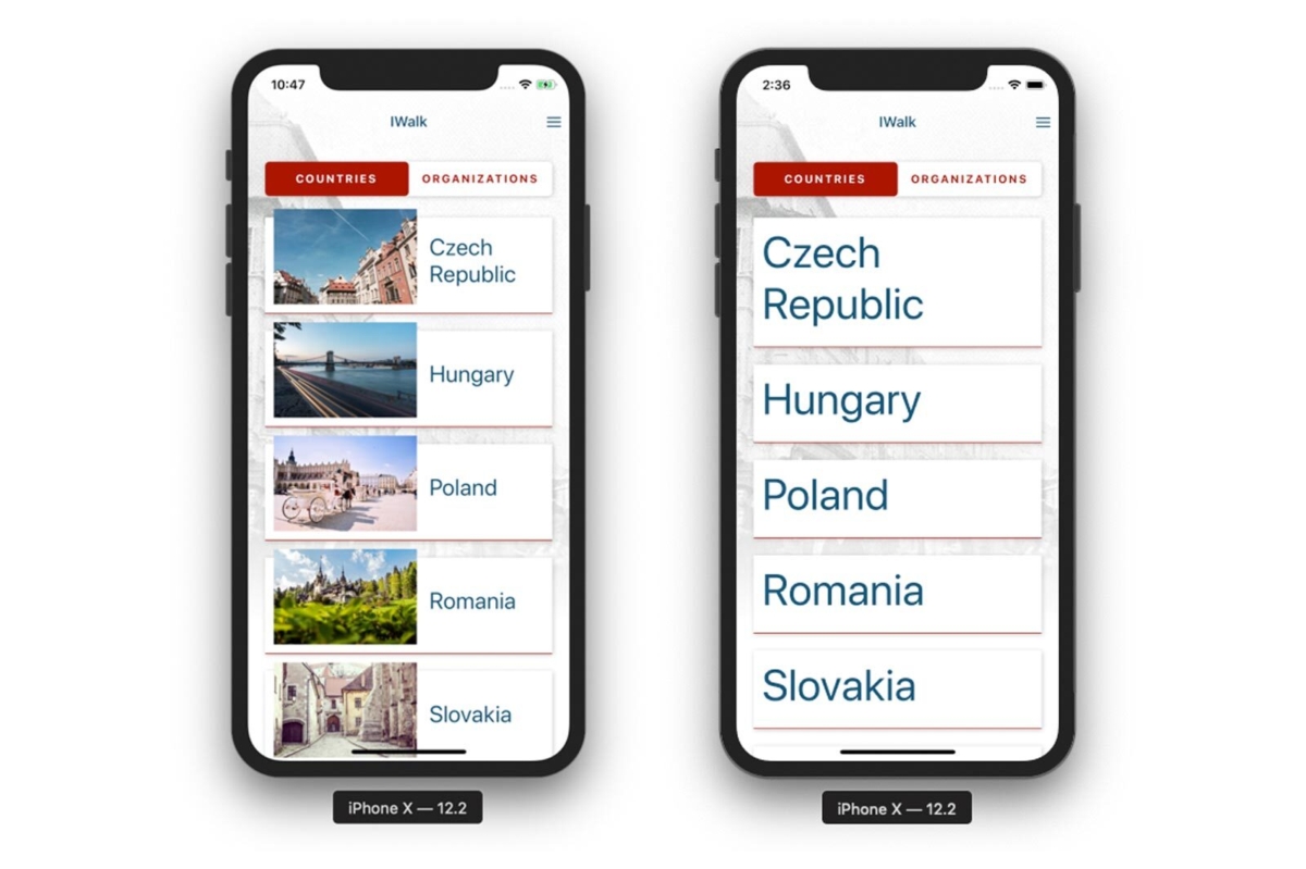
With our Country card component we opted to hide the image when the country name reached a certain size. The image, though helpful for way finding, is not essential for understanding what the country is. Instead, it hindered readability with the larger text.
We placed the PixelRatio.getFontScale() property within a conditional statement.
If the device’s font size is smaller than 1.2 times the app text size, then display the image. Otherwise, hide the image and let the country name take up more space.
{PixelRatio.getFontScale() < 1.2 && (<Image source={{ uri: imageUrl }} /> )}
Readability: Text contrast and styling
AAA contrast
Outlined by WCAG 2.0 (Web Content Accessibility Guidelines), most text needs to contrast its background with a ratio of at least 4.5:1 A handy tool we’ve used is Contrast to check our text color. This app is meant to be used outdoors, and even on the cloudiest days, apps with low contrast are difficult to see.

Inverted color mode
In 2017, Apple released Smart Invert. It automatically recognizes images and doesn’t invert them. There still remains the Classic Invert, where images will get inverted. Just in case this option is selected, we applied accessibilityIgnoresInvertColors to all the photographs:
Voiceover
With accessibilityLabel and accessibilityHint we provided text for the phone’s voiceover to read. Hints are read after labels and provide further context to the element if needed. A good tip is to add commas or colons to create a pause in the voiceover reading.
accessibilityLabel: “, Walk duration of: “
The comma created a pause between the previous and current label; and the colon provided a pause before reading the duration in minutes.
Content
Content is king and this app was no exception to this rule. Our client and content team, USC Shoah Foundation, worked hard to distill the writing, provided text in other languages and VTTs (subtitle files) for videos. In our perspective, these are all still part of the goal to provide access to more people.
A few thoughts about accessibility
Before the project started, I attended Kat Holmes’ talk at Seattle Town Hall. Her book “Mismatch” is a great read on the subject. One of the most poignant lessons I learnt was this:
For me, accessibility has been and continues to be, an ongoing learning experience. There are new lessons everyday. There are technicalities to understand, but also, and more importantly, cognitive habits to unlearn and re-learn.

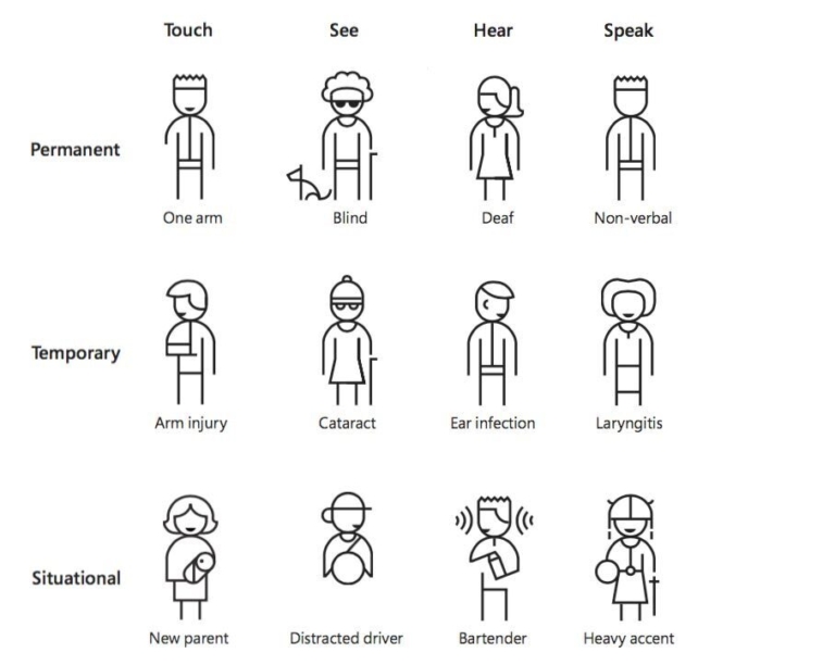
As Holmes’ diagram illustrates, access encompasses more than just legal disabilities, but also situations and environments.

When someone is having difficulty using an app or device, it’s common to hear remarks of feeling dumb or outdated. As a team, it was important to acknowledge that it’s never our audience’s fault, but ours for not making it easier. Without this attitude, it would have been difficult to prioritize accessibility stories with other features.

Regardless of age or health, everyone has a different level of access to the experiences around them. Orienting myself towards accessibility has also raised my awareness of the needs and abilities of those around me. Even the young and technically experienced will encounter barriers to access.

Instead of solving for the 80% and leaving out the 20%, if we design for extremities in readability and access, we position ourselves better to solve for the 99%.
About our project
Our team of three developers, one designer, and one engagement manager completed this MVP app in ~14 weeks.
Client: USC Shoah Foundation
Android: Google Play Store
Apple: App Store
How to try out accessibility features on your smartphone
Enlarge text
iOS: Settings > General > Accessibility > Larger Text
Android: Settings > Accessibility > Font Size
Invert colors
iOS: Settings > General > Accessibility > Display Accommodations > Invert Colors
Android: Settings > Accessibility > Color inversion
Voiceover
iOS: Settings > General > Accessibility > VoiceOver
Android: Settings > Accessibility > Select to Speak or TalkBack
Gestures will be different under VoiceOver. For example, to select an item, you need to tap it once, then double tap it to open it.
Resources
Kat Holmes
React Native Documentation: Accessibility 2018 Update
Accessible colors
Contrast app
WCAG 2.0 Contrast (minimum) documentation
Accessibility Scanner app for Android